
Redesigning the AI Desktop Planner
Improving usability, workflow clarity, and feature accessibility to drive engagement and secure investment.
Timeline
Team (10)
Product Manager, UI/UX Designers, UX Researcher, Developer Team, Marketing Team
Business
The ambitious MorningKai team of tech founders and developers were focused on launching a transformative AI work/life management tool for busy urban individuals, as they finalized their funding application.
Role & Responsibilities
UX Designer responsible for user research, wireframing, prototyping, usability testing, and UI design
Overview
MorningKai is an AI-powered productivity tool that transforms unstructured thoughts into organized plans, tasks, and schedules for more balanced daily routines.
I joined the team during a critical phase as they prepared a prototype and pitch for early funding. User testing revealed that while the core idea resonated, the execution lacked clarity, accessibility, and engagement—making it difficult for users to navigate the product or build habits.
I led the redesign of the desktop experience, focusing on usability, visual hierarchy, and interaction patterns to turn a promising concept into a functional, intuitive, and fundable product.
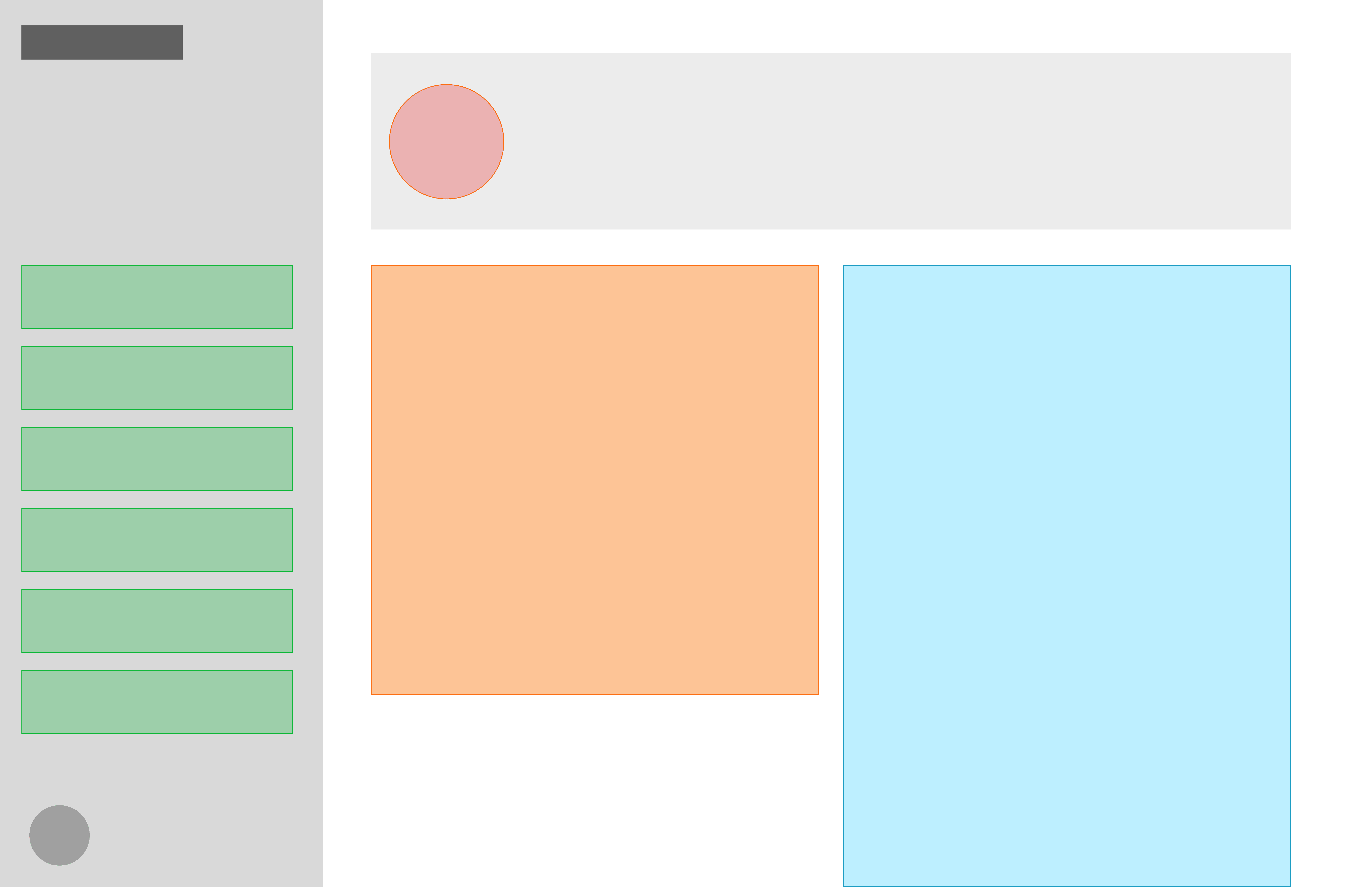
Before
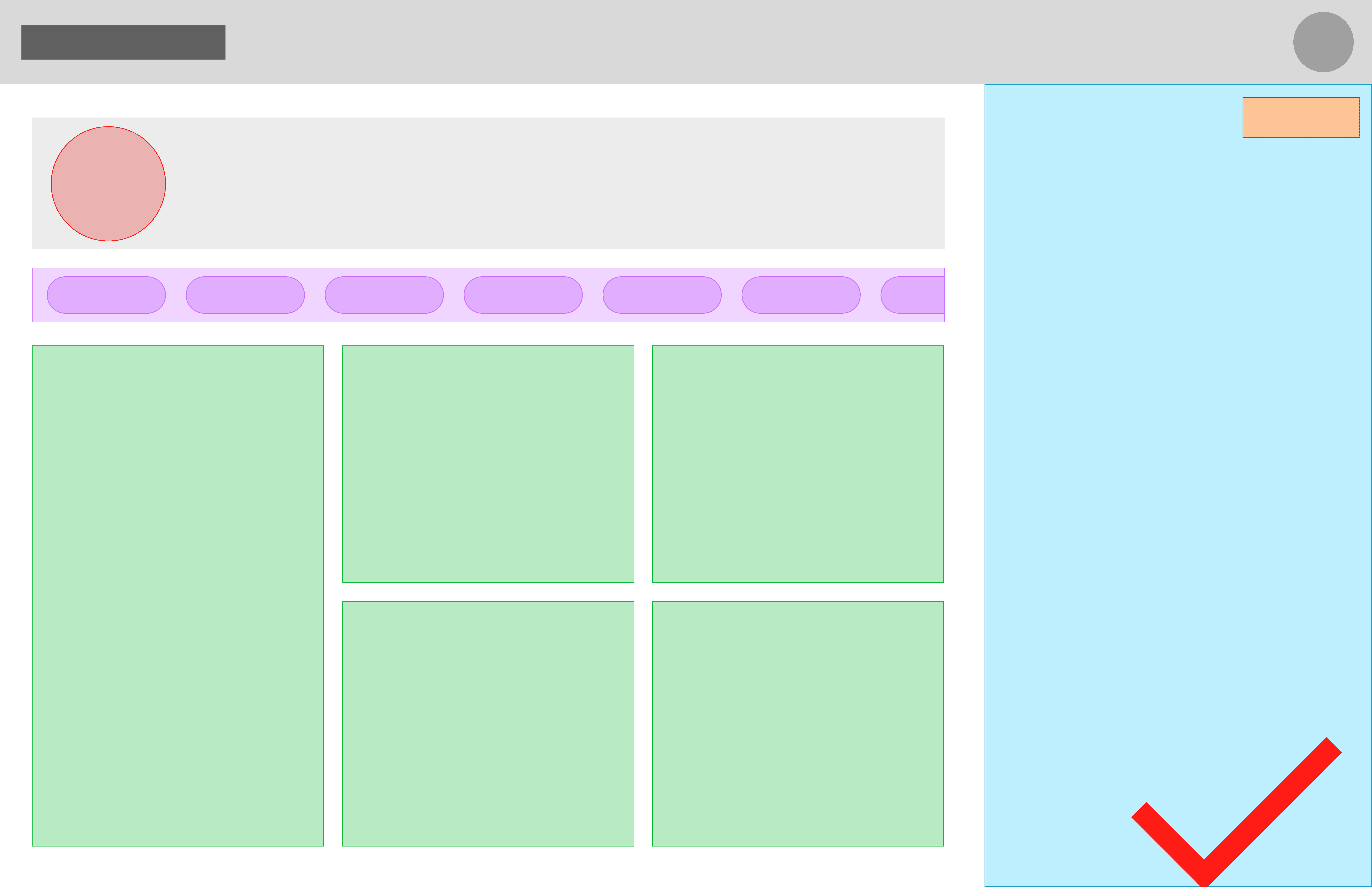
After
Design Impact: Funding Secured

+30%
in User Activation Rates

From 60 to 85
in System Usability Score

Positive Feedback
From Potential Investors
Our User
Meet Chloe Garcia - The Ambitious Multitasker
Chloe is a 26-year-old marketing manager at a fast-paced tech company. Her days are filled with meetings, deadlines, and last-minute tasks, leaving little mental space for herself.
She values balance—growing her career while making time for hobbies, relationships, and personal well-being.

The Problem
The concept of AI-assisted planning resonated with users, but poor usability prevented adoption.
For users like Chloe Garcia, the prototype felt confusing and difficult to integrate into daily routines. Unclear navigation and weak information architecture made it hard to know where to start, while AI-generated task lists felt visually overwhelming due to poor hierarchy and structure.
As a result, Chloe couldn’t imagine using the tool consistently to turn scattered thoughts into a usable plan.
AI-assisted analysis (Claude and Google Bard) reinforced these issues at scale:
78% struggled to navigate the dashboard
64% found task outputs cluttered
82% said they wouldn’t use the product in its current state
The problem wasn’t the idea—it was the lack of clarity, structure, and consistency in the experience.
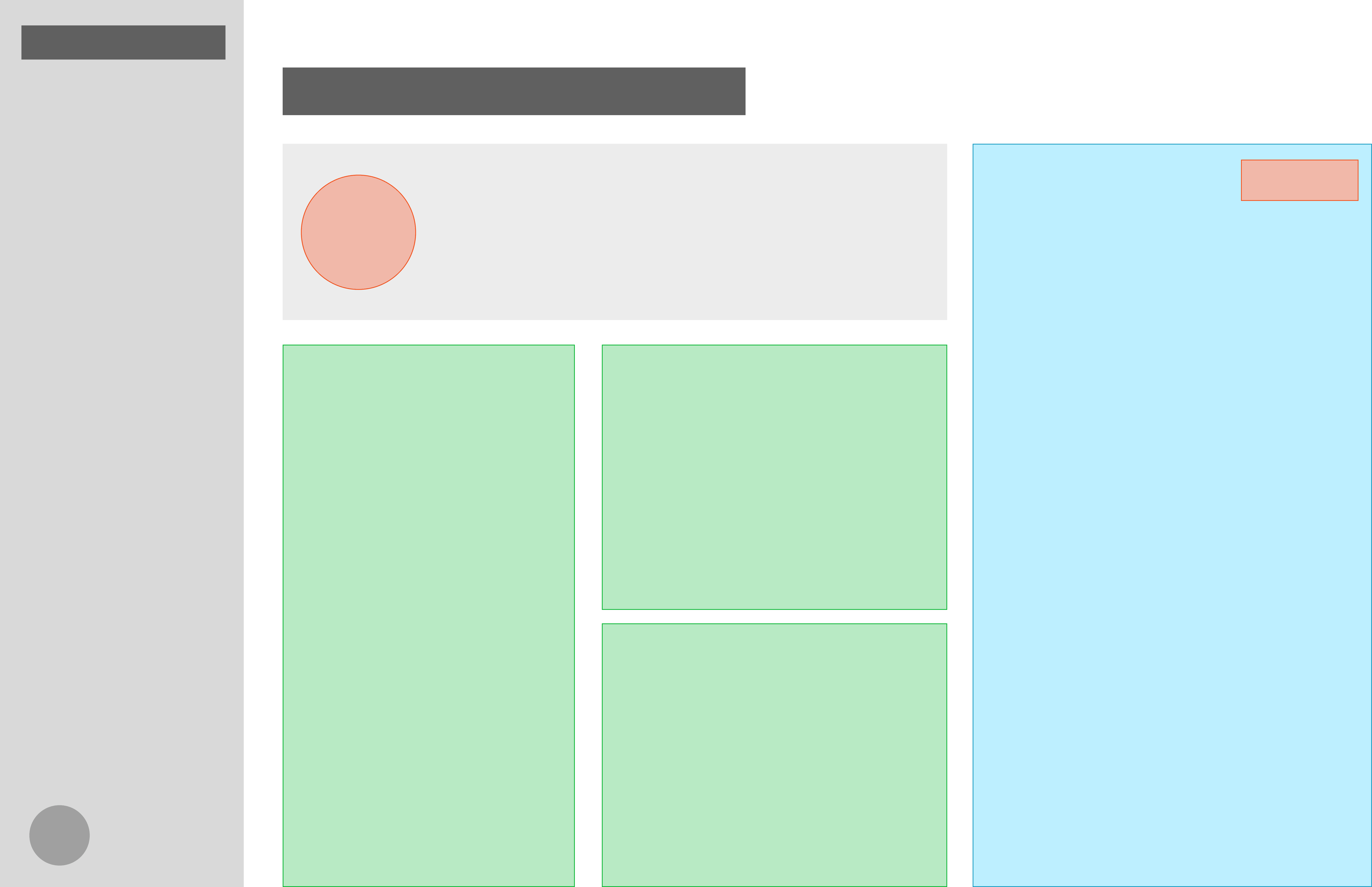
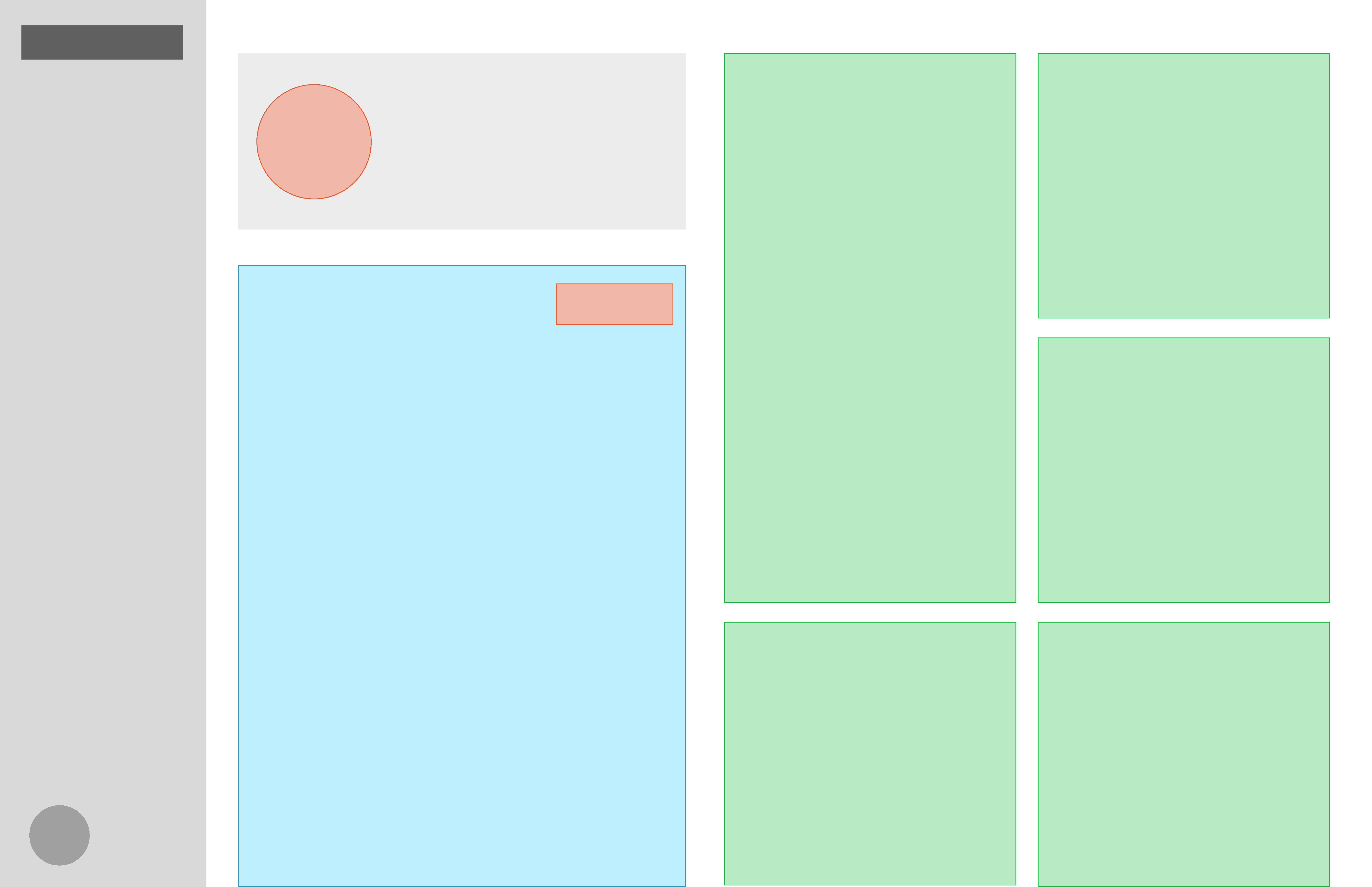
What's not working with the initial prototype?

Design
Phase 1: Establishing a Clear Visual Hierarchy
Research revealed key usability and clarity issues, which led me to define a set of design priorities. These priorities guided a clearer visual and functional hierarchy, making essential features more prominent and intuitive.
Design priorities:
A prominent thought-capture entry to jump-start planning
Category buckets to reveal activity patterns and support balanced schedules
A clear to-do list for easy task tracking
Simple date navigation for past and future plans
With these priorities in place, I reorganized the dashboard layout to elevate the most important features within the visual hierarchy.

Establish a category-first hierarchy, separating planning (buckets) from execution (to-do list)

Guide users toward action by simplifying the dashboard around today’s priorities.
Reorient the dashboard around task execution, with categorization as secondary support.
De-emphasize categorization in favor of execution and calendar-based scheduling

To validate the design priorities, I tested low- to mid-fidelity prototypes that explored different layouts for core features. Usability sessions revealed clear preference patterns and areas needing refinement. I moved forward with the first direction because centering the dashboard around categorized task buckets reinforced MorningKai’s core value: helping users visualize balance, recognize behavioral patterns, and actively reprioritize their schedules.
Key findings from testing:
82% of users noticed and preferred a more prominent recording CTA
91% found a unified chronological to-do list easier to navigate than separate lists
76% said task categories helped them recognize patterns and plan more balanced schedules
Over half overlooked the date-selection button when placed at the bottom, leading to a redesign that moved it to the top
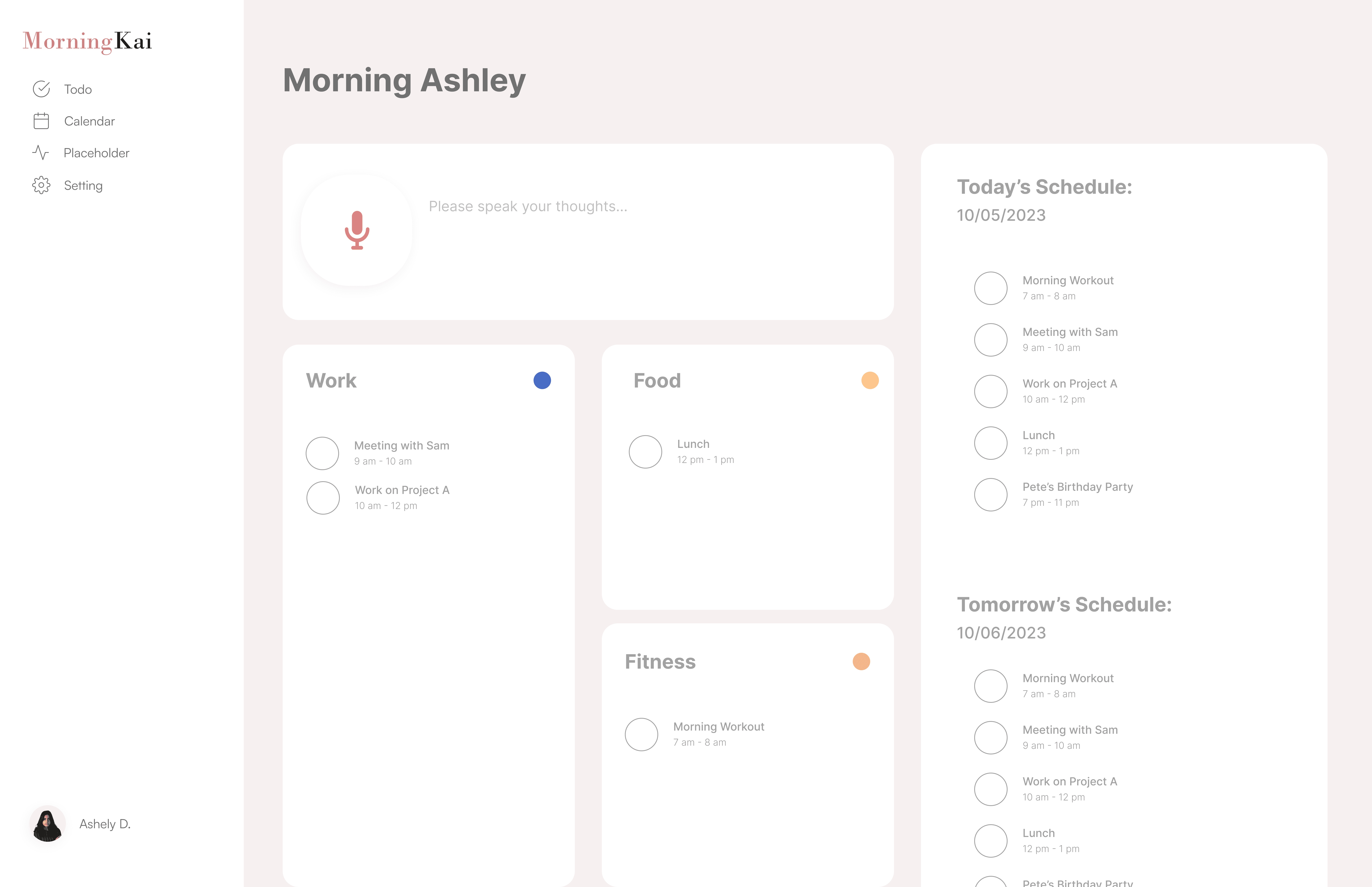
The final dashboard introduces a clear visual hierarchy that highlights key features and enables faster thought capture, easier task tracking, clearer activity patterns, and more intuitive date navigation.

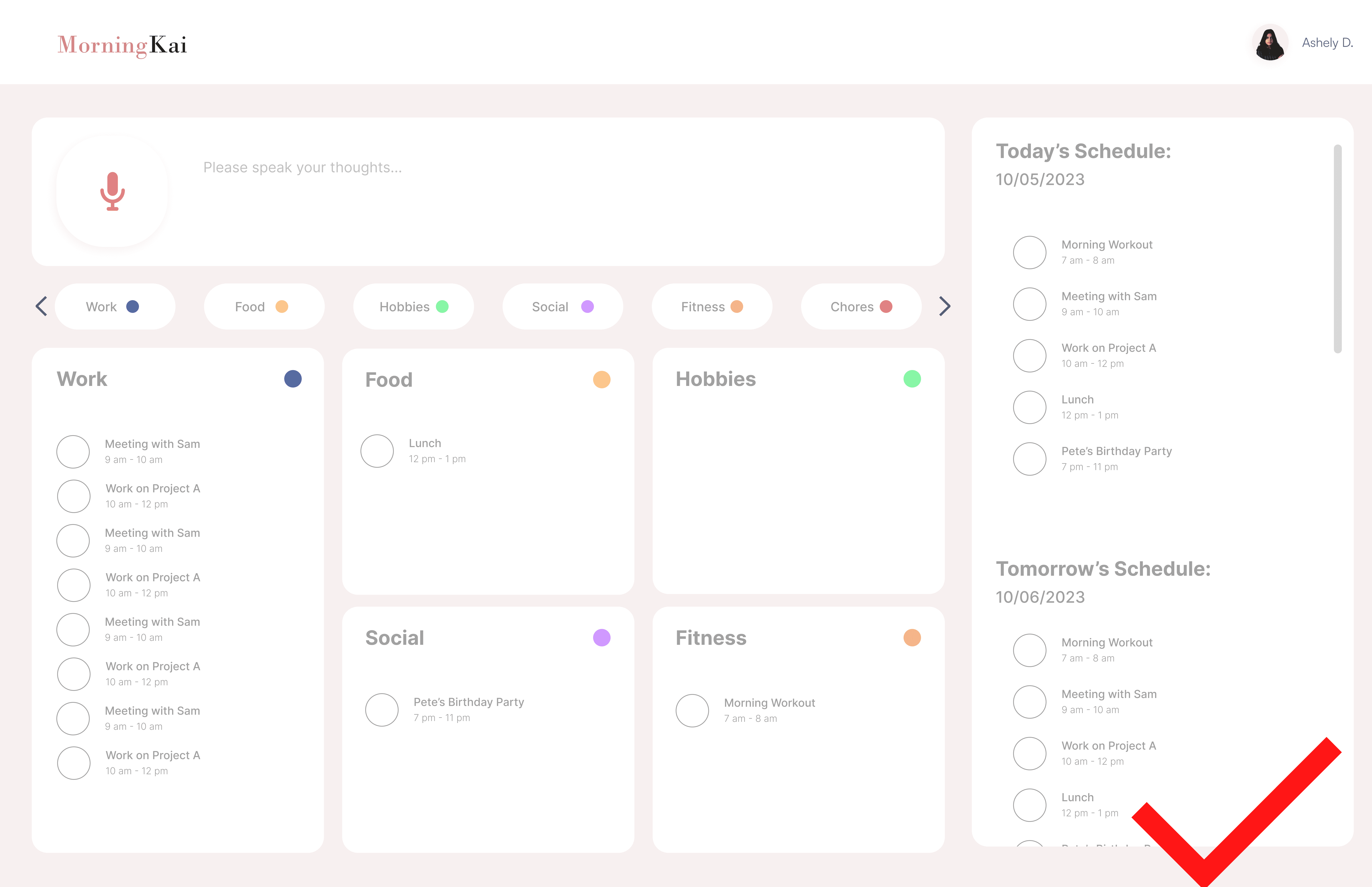
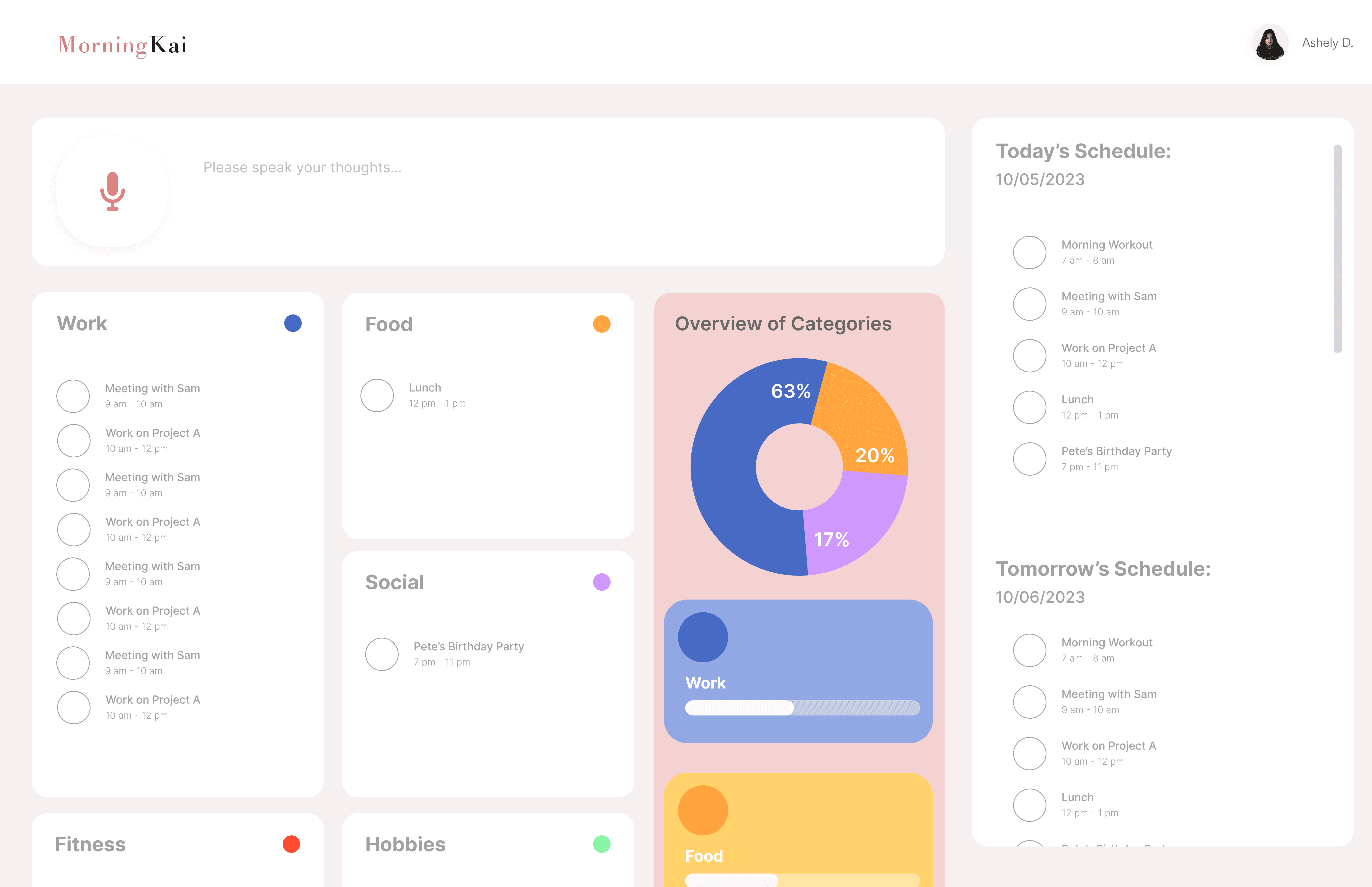
Make the primary action unmistakable
Chloe begins her day by capturing her thoughts using the prominently placed record button. This intuitive entry point makes it easy for her to quickly articulate ideas and tasks, setting the stage for a structured and organized planning experience.
Pain point: Unclear starting point.
Solution: Prominent microphone CTA for thought capture.
Impact: Faster onboarding and clearer workflow.
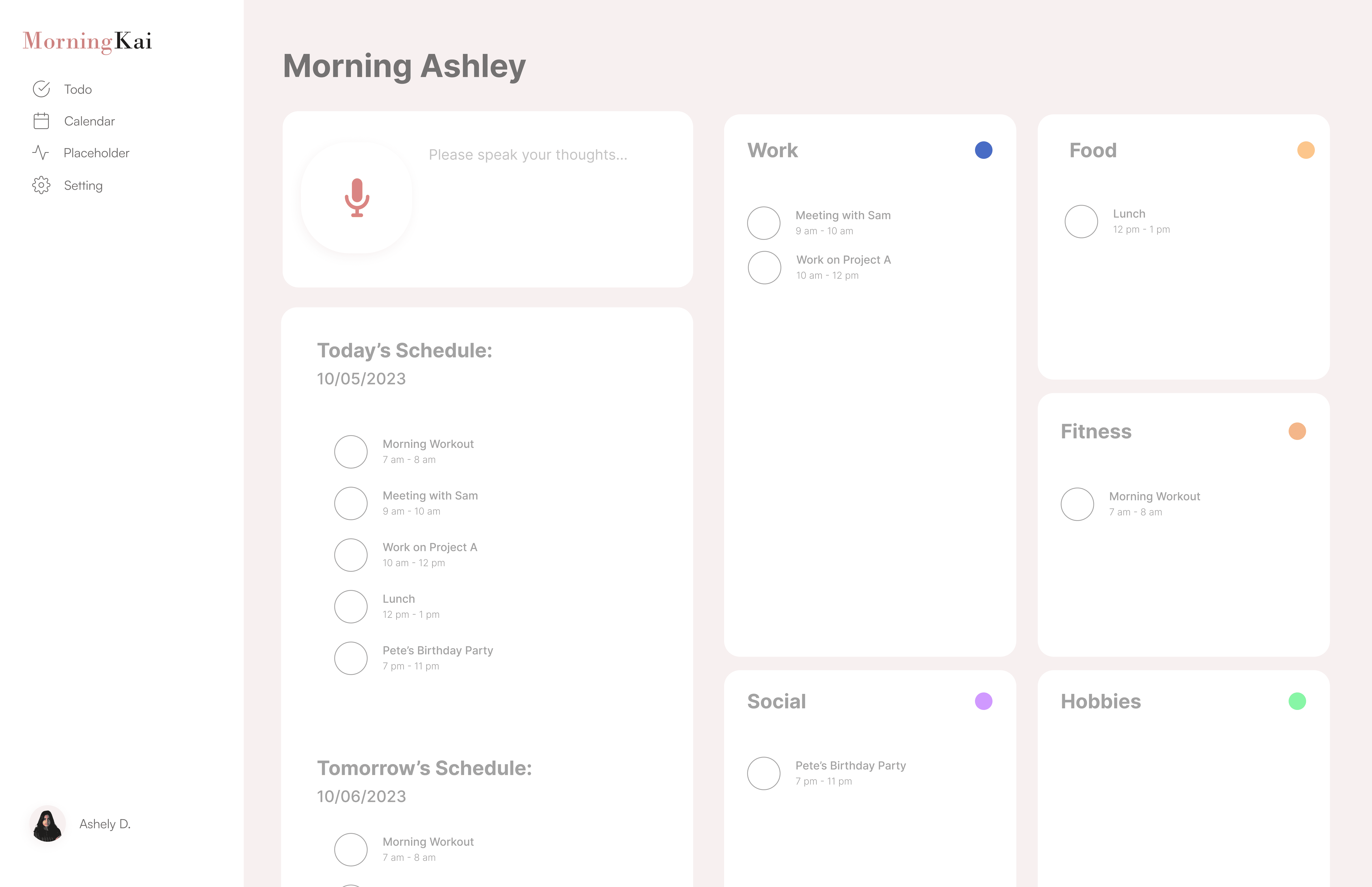
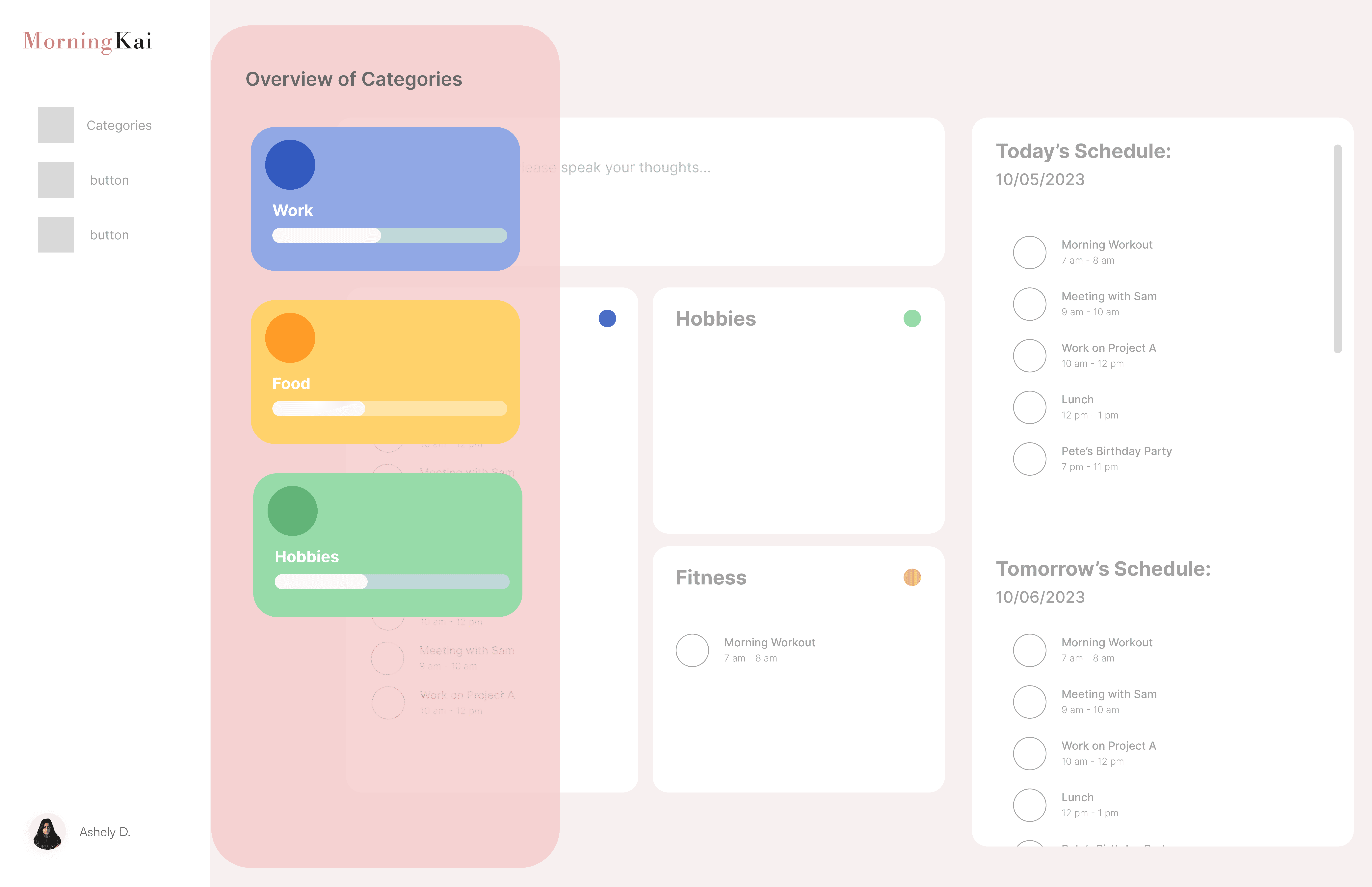
Category buckets that reveal activity patterns and support more balanced schedules
Next, Chloe organizes her recorded tasks into categories that reflect different types of activities. By visualizing these patterns, she can easily spot imbalances in her schedule and adjust her plans, helping her create a more structured and balanced daily routine.
Pain point: Poor task hierarchy.
Solution: Redesigned task buckets with clear structure.
Impact: Faster scanning and lower cognitive load.
A clear to-do list for easy task tracking
Chloe uses the unified chronological to-do list, which combines past, present, and future tasks in a single view. This streamlined approach makes it easy for her to track and navigate her schedule without juggling multiple lists, reducing distractions and helping her stay organized at any time.
Pain point: Limited date navigation.
Solution: Calendar jump.
Impact: Flexible, user-controlled scheduling.
Simple date navigation for viewing past and future plans
Finally, Chloe uses the date navigation to jump directly to any specific day in her schedule. This eliminates the need to scroll through multiple pages, making it faster and easier for her to access past and future plans and stay on top of her tasks.
Pain point: Fragmented task lists.
Solution: Unified task list.
Impact: Clearer, uninterrupted workflow.
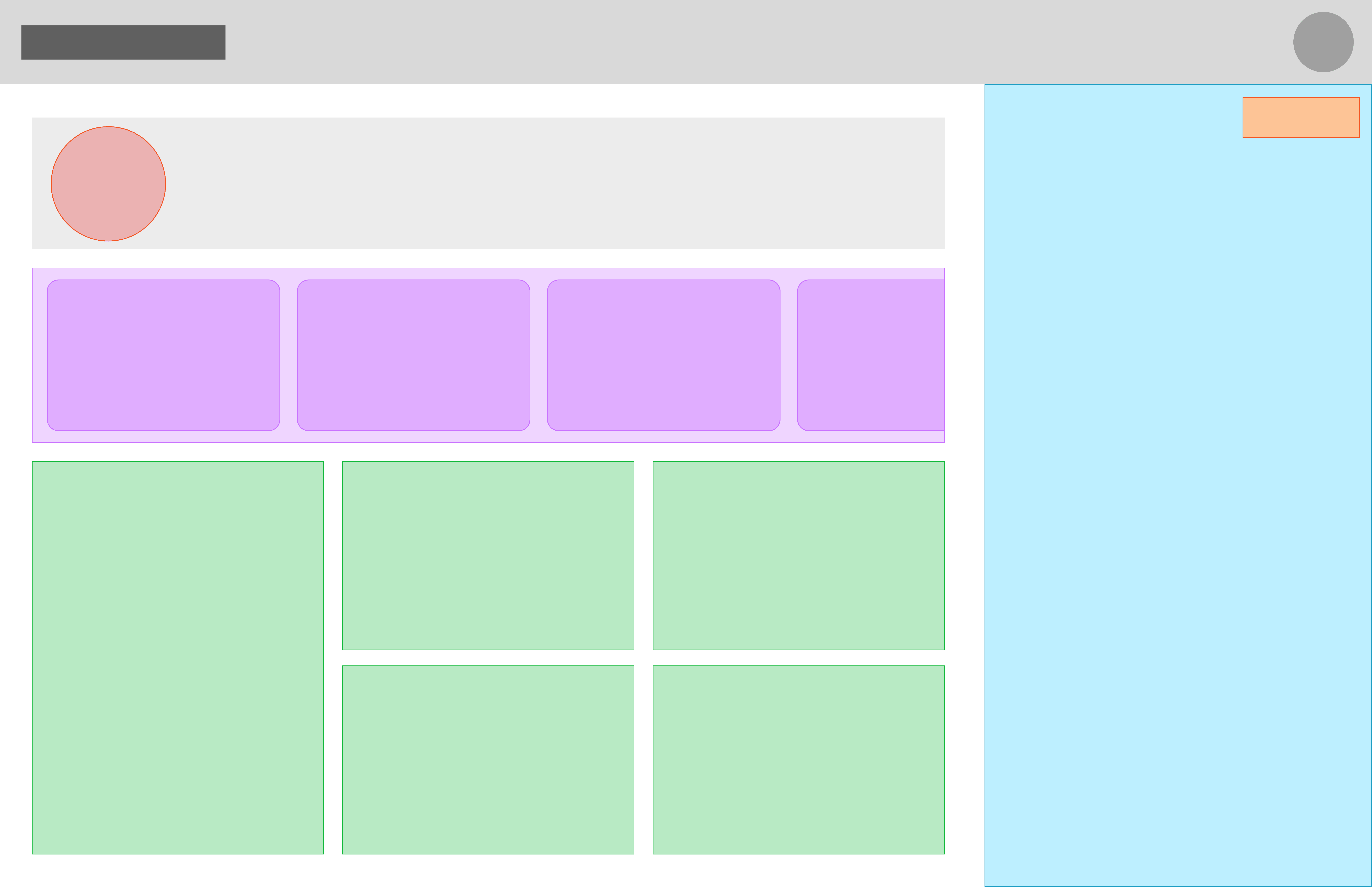
Phase 2: Introduce a new feature - Thought-Starter Scroll Navigation
Users felt overwhelmed deciding what to plan each day; 68% said prompts would help support balanced routines. They wanted gentle, goal-aligned reminders and customizable activity categories.
These insights led to the Thought-Starter, an interactive tool that helps users customize activity categories for balanced, goal-oriented planning.
What the Thought-Starter Scroll does:
Reminds users of tasks they may need to consider
Highlights activity categories they might overlook
Allows users to set and customize priorities
Stays lightweight, non-distracting, and easy to navigate
I explored multiple approaches to how the Thought-Starter could support users:
Test a low-profile, horizontal prompt system that encourages daily brainstorming with minimal visual friction.
Use category cards to provide a high-level overview that sparks planning and reveals overlooked areas

Explore an on-demand category overview that supports reflection without crowding the dashboard
Explore visual summaries that reveal activity balance before diving into category-level progress
Usability testing confirmed the impact of the Thought-Starter Scroll:
85% of participants said it helped them think of activities they might have forgotten
78% felt more confident that their plans aligned with their goals
Among the concepts tested, the minimal horizontal Thought-Starter performed best. Participants found it easy to engage with while planning, without pulling focus away from task execution. Despite its low visual footprint, users were still able to reflect on overlooked categories and recognize imbalances in their daily plans—supporting awareness without added cognitive load.
As a result, this direction was chosen to move forward, prioritizing gentle prompting over persistent visual analysis to keep planning focused and distraction-free.
Now, we can explore how Chloe uses the feature in her daily planning…
Chloe interacts with the Thought-Starter Scroll to set and customize her activity categories, guiding her planning for a more balanced day. As she scrolls through the categories, she is prompted to consider tasks she might otherwise overlook, helping her align daily activities with her goals. This intuitive and non-distracting feature ensures Chloe can plan confidently, stay organized, and maintain a sense of balance throughout her day.
